About
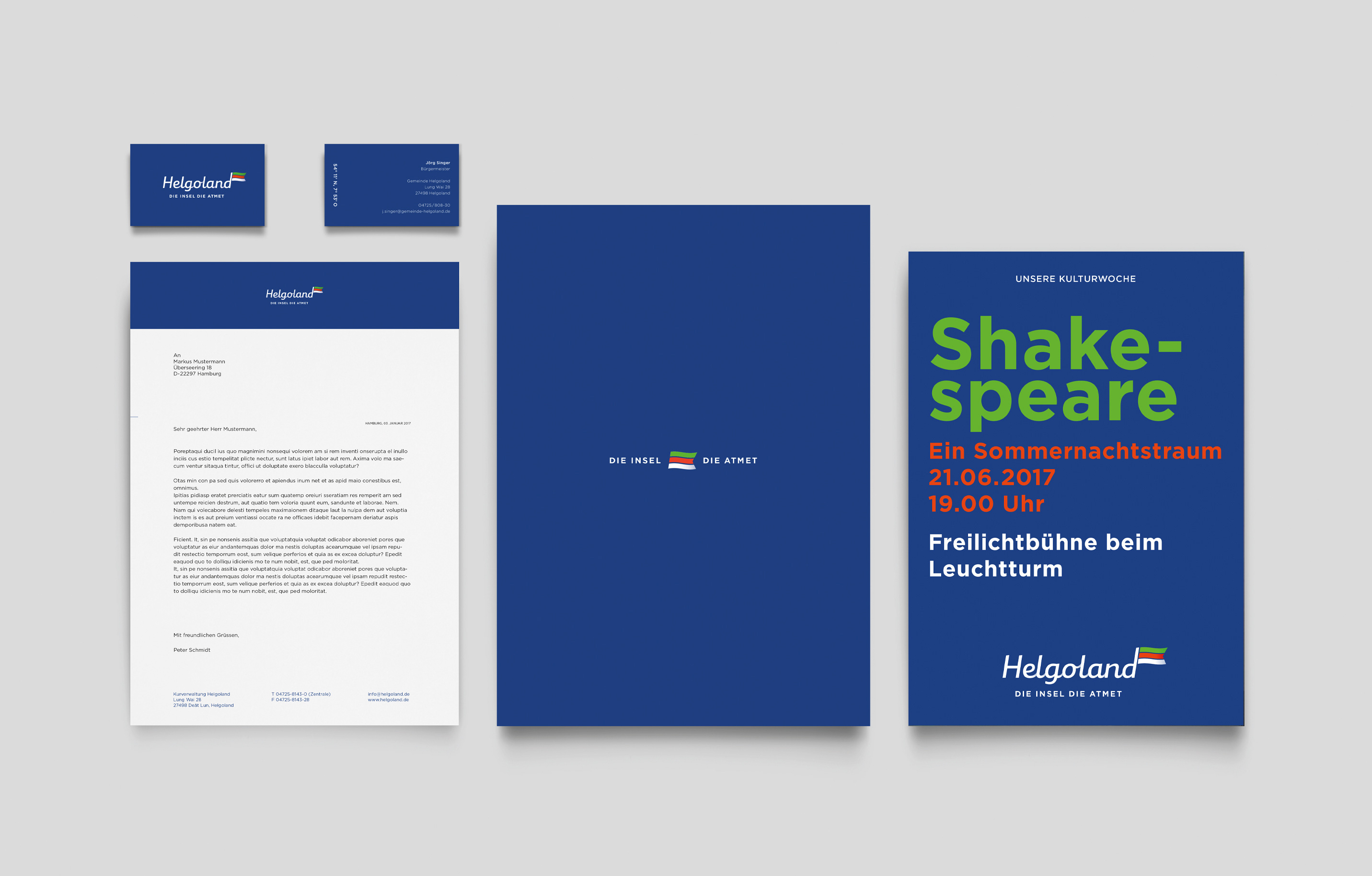
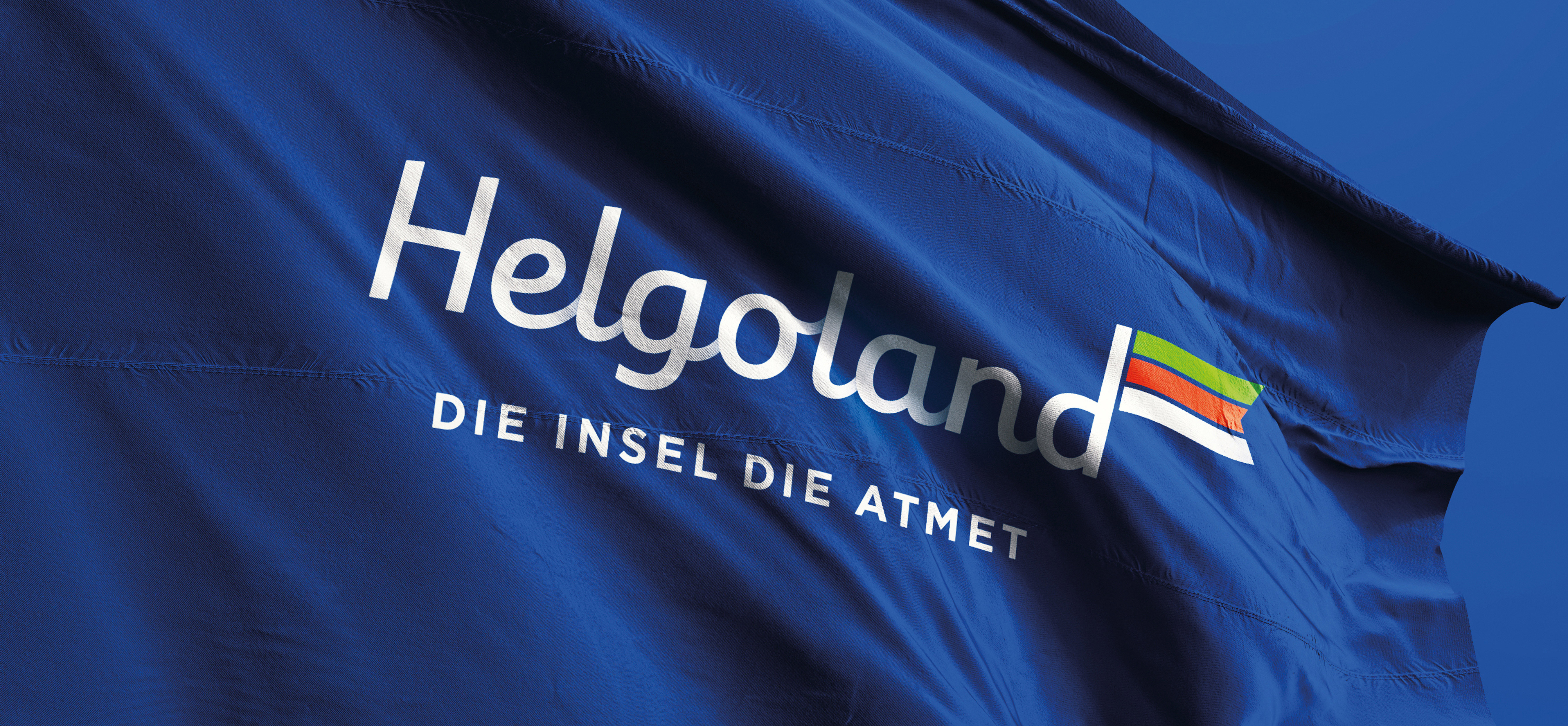
The German island of Helgoland in the North Sea commissioned THE STUDIOS to reimagine and redesign their brand. The Logo mark was developed with consideration for the island by using a waving flag. This denotes the dynamic character of the island, yet manages to keep it light and playful. This dimension and light movement captures the healthy breezes attributed to Helgoland. The flag represents the island flag and the island colours are used throughout the corporate design, forming an entity and thus an identity recognisable to Helgoland.


THE LOGO CAPTURES THE COLOURS OF
THE ISLAND AND THE MOVEMENT OF
THE WAVES AND THE BREEZE.

